Isandla
In Design
Overview
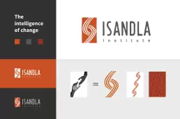
Isandla was looking to modernise their primary and secondary brand languages. We explored a few routes – keeping with helping ‘hands’.
A symbol that shows the way in which Isandla assists communities as well as humanity as a whole.
Logo idea exploration
In the end, we decided to remain true to the organisation and its heritage by simplifying the ‘hands’ symbol from their original logo and making it more iconic. Essentially a refresh and not a revolution.
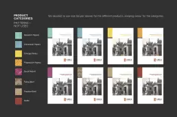
The icon was further explored as a pattern ‘chain’ link becoming a symbol for the power of connectivity and community based building.
In closing
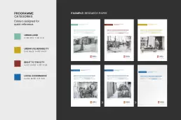
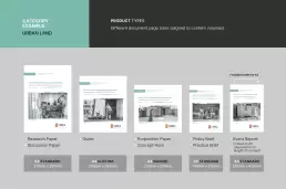
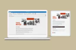
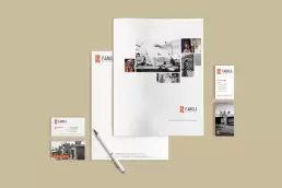
Graphic design for print and a small digital component (PPT, emailers, etc).
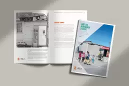
Photography: Images supplied
Without organisations like Isandla so many people in South Africa would simply fall between the cracks. Giving those who struggle, a helping hand is something that we can all do in whatever small way possible.